How to See What Changed in Your Pipeline Between Two Dates With Weflow Snapshots
Learn how Weflow snapshots show Salesforce pipeline changes between two dates.


A Salesforce opportunity holds one version of itself: the amount, stage and close date it has right now. It carries no record of what it looked like on the first of the month, which is why "what changed in our pipeline between these two dates" has no answer inside the CRM, however carefully your admin has configured it.
The fix is a stored time series. Weflow snapshots opportunity data every few hours, builds its own history from those snapshots, and differences them into a clickable pipeline waterfall that reconciles starting pipeline to ending pipeline through created, increased, moved in, moved out, lost, decreased and won.
That's the view most teams currently hand-assemble before every deal and pipeline review.
Below is the mechanism, the view it produces, the setup, and the two places where the history and the analytics stop. If you're comparing paths right now, the limits matter as much as the capability.
Why Salesforce can't show your pipeline at a past date
Salesforce is a current-state database. The opportunity record stores the value a field has, not the values it had, so there is no series of past states to difference against today. That's the whole diagnosis, and it isn't a configuration failure.
Three specific dead ends follow from it:
- The opportunity record is current state. Change the amount from 200,000 to 120,000 and the old figure is gone from the record. Nothing on the object remembers the deal was ever worth more.
- Field history tracking doesn't cover calculated or roll-up fields. So even an admin who enabled tracking on day one can't reconstruct a pipeline total over time, because the numbers a forecast runs on are exactly the ones Salesforce won't history-track.
- There's no native view of how pipeline develops over a period. Salesforce ships no waterfall and no period-over-period pipeline development report, so every version of it is a custom build, and it gets rebuilt each time leadership changes the question.
That last one is why this problem never stays solved. Every new question from the exec team turns into a reporting project, and the number that answers it ends up living in a spreadsheet rather than in the system.
Our forecast is, let's just say 5,000 units at the beginning of the month. Now it's about 3,000. And we actually are probably going to end around maybe 2,000. There's not a lot of indication of why those have occurred.
Why comparing two dates still doesn't show what moved
Storing two dates and diffing them answers what the pipeline totalled on day one and on day thirty. It doesn't tell you what happened in between, because movement nets out.
A deal created and lost inside the period leaves no trace in an endpoint comparison. Neither does a 400,000 slip out of the quarter offset by a 400,000 pull-in from the next one.
Two photographs, taken a month apart, of a pipeline that changed shape a dozen times.
Credit where it's due: Clari's pacing view and its quarter-versus-quarter comparison are genuinely the views revenue teams use, and its waterfall compares one date to another.
But comparing endpoints is not the same as showing movement, and that's the reason a team with Clari still rebuilds the analysis in a BI tool every cycle.
| What an endpoint comparison answers | What a pipeline review actually asks |
| Pipeline was 5,000 on day one and 2,000 on day thirty | Which deals slipped out, and how far did they push |
| Net change was minus 3,000 | How much of that was amount decreases versus losses versus pushes |
| Coverage fell below target | What we created mid-period, and whether it replaced what we lost |
| The quarter ended thin | Which reps are chronically pushing the same deals every cycle |
How Weflow's continuous snapshots reconstruct pipeline movement
Weflow is the Revenue AI Orchestration platform for sales, customer success, and RevOps teams, and this part of it rests on one unglamorous mechanism: Weflow snapshots opportunity data every few hours, so it holds its own history of the pipeline rather than reading a CRM that only holds current values.
That's the whole trick, and it's why any two points in time become comparable.
The continuity is what does the real work.
Because the snapshots run every few hours rather than at the start and end of a period, the changes between two dates arrive as separate events instead of one net figure: a deal created, an amount raised, an amount lowered, a deal pulled in from a later quarter, a deal pushed out, a deal lost.
Weflow differences consecutive snapshots and attributes each change to the bucket it belongs in.
Two things surface from a time series that a live pipeline report structurally cannot show you:
- Chronic slippage. A deal that has moved its close date four times looks identical in a live report to one sitting on its original date. In the snapshot record, the pattern is the data.
- Sandbagging. Amounts that get quietly lowered early in a period and raised again at the end net to nothing on a current-state report. In the series, both moves are visible with dates attached.
This is also the honest reason a forecasting tool has to snapshot: no model can tell you a deal is stalling if nothing anywhere recorded what the deal used to look like.
How to read the Weflow pipeline waterfall's seven buckets
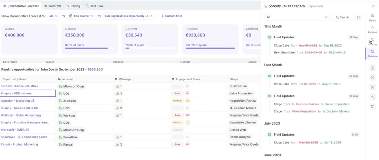
The waterfall reconciles starting pipeline to ending pipeline through seven buckets, and every unit of change lands in exactly one of them.
| Bucket | What lands in it |
| Newly created | Opportunities created inside the period with a close date in it |
| Increased | Amount raised on a deal that was already in the period |
| Moved into the period | Deals whose close date was pulled in from a later period |
| Moved out | Deals whose close date was pushed beyond the period end |
| Lost | Deals closed lost inside the period |
| Decreased | Amount lowered on a deal that stayed in the period |
| Won | Deals closed won inside the period |
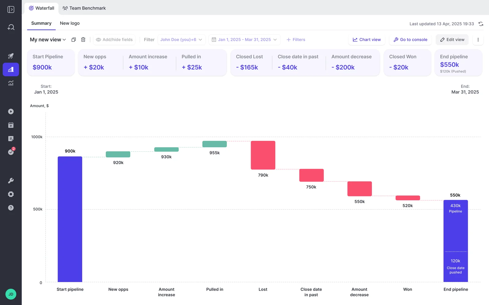
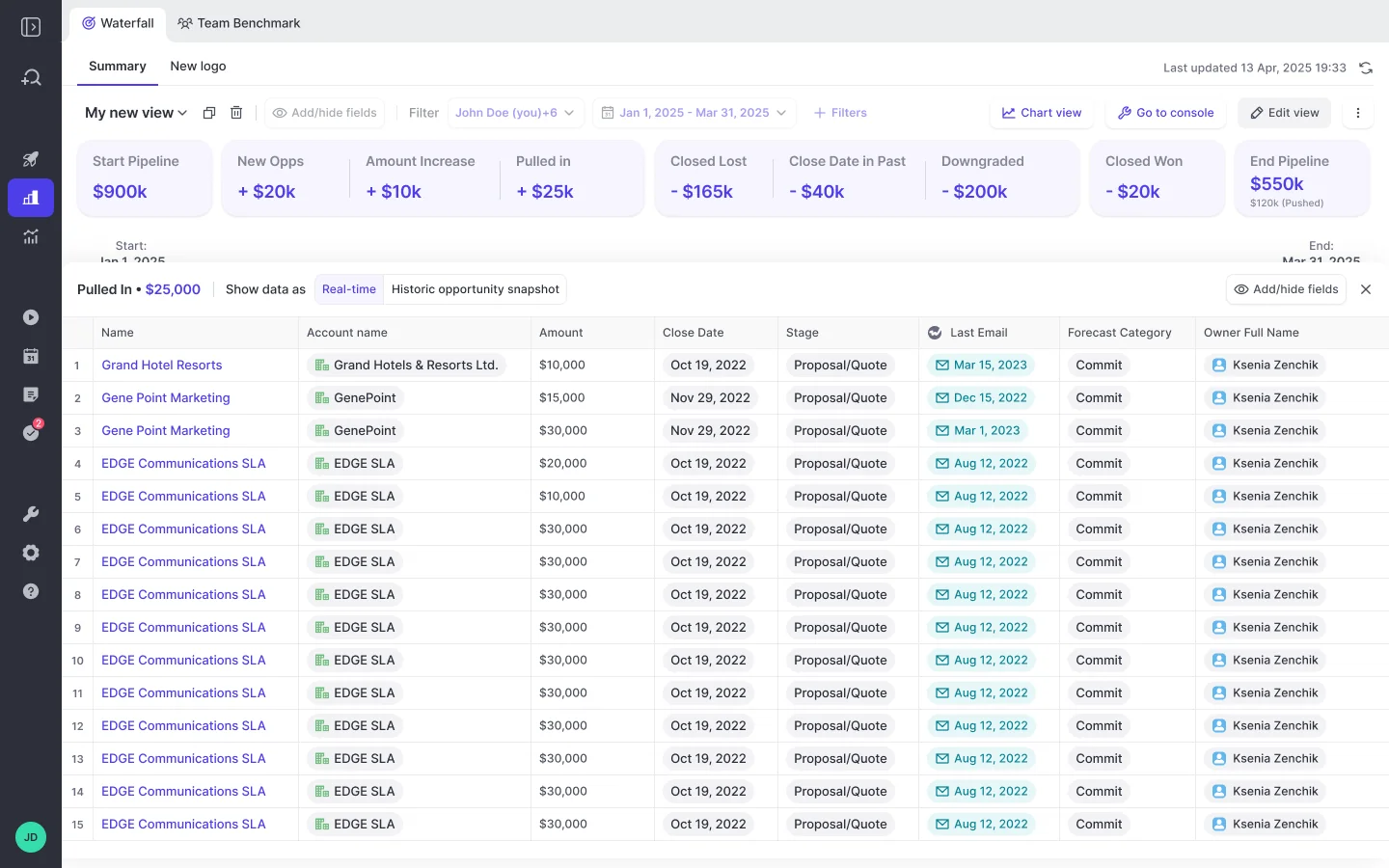
Every bucket is clickable. Click "moved out" and you get the actual opportunities that pushed, with whatever fields the viewer cares about on the table: owner, stage, amount, close date, how many times that close date has already moved.
That's the part that decides whether you're back in a spreadsheet ten seconds after the first follow-up question.
Walk the leadership question through it. A quarter opens at 5,000 and lands at 2,000. The waterfall splits the 3,000: some of it is losses, some is amount decreases, some is deals that moved out. Click the moved-out bucket, and you have the named deals, the owners, and the push counts. The answer to "where are we getting pushed" is a click, not an investigation.
How Weflow tracks days in stage and close-date pushes
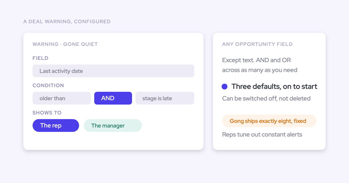
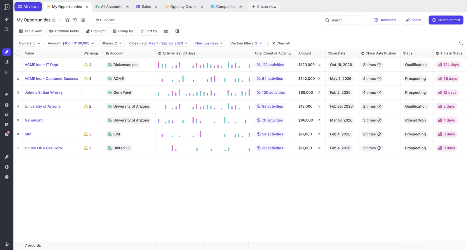
Weflow tracks days in stage and total close-date push count automatically on every opportunity, with no custom fields and no automation for your team to build or maintain.
Those two signals carry most of the slippage story:
- Days in stage exposes deals running long against your own benchmark for deals that eventually closed won.
- Close-date push count exposes the deals whose date keeps moving, which is the pattern nobody spots deal by deal in a weekly review.
The reason to have them captured rather than built is that the warnings and benchmarks sitting on top of them can exist from day one, instead of arriving as another two custom fields and a flow somebody has to own forever.
Deals are always pushing, deals are always changing, and just understanding where we're getting pushed would be nice.
Benchmarks are what turn the raw number into a decision.
Without internal benchmarks you will not know what is good and what is bad.
— Philipp Stelzer, CPO and Co-founder of Weflow
How much pipeline history Weflow gives you on day one
You get up to 12 months of historical Salesforce data imported by default into Weflow forecasting and pipeline analytics, and the continuous snapshot record starts building from the moment Weflow runs.
Now the part that isn't flattering, because you'd find it in week two anyway:
- The every-few-hours snapshot record only exists going forward from go-live. For the period before that, Weflow is reconstructing from what Salesforce kept.
- Historical accuracy for custom fields depends on Salesforce field history tracking having been enabled beforehand. If it was off, that history was never written anywhere, and no tool recovers it.
| History before go-live | History after go-live | |
| Standard opportunity fields | Imported, up to 12 months | Snapshotted every few hours |
| Custom fields | Only as accurate as your Salesforce field history tracking was | Snapshotted every few hours |
The practical read: if you're inside a renewal window and want a full year of clean movement data, switch field history tracking on for the fields you care about now, whatever tool you end up choosing. That decision has a twelve-month lag on it either way.
Setting up Weflow opportunity snapshots and your first waterfall
There is no build project here, which is the actual point of this section. The sequence:
- Sign in through your own Salesforce authentication. Weflow supports no email-and-password login, so it uses the OAuth and SSO your org already enforces, and deactivating a user in Salesforce removes their Weflow access.
- Install the managed package with your Salesforce admin. Installing it and starting the sync is under an hour of admin time.
- Connect the mail and calendar tenant with your Google Workspace or Microsoft admin. The technical setup runs 30 to 45 minutes end to end.
- The historical import runs by default, pulling up to 12 months of Salesforce data.
- Snapshots start building on their own. Nothing to schedule, nothing to maintain.
- Open the waterfall, pacing and stage conversion views. They ship configured, not as reports someone assembles.
Full time to value is typically two to three weeks, and almost all of that is business logic rather than plumbing: which pipeline views each team sees, which warnings fire, quotas, forecast types and cadences.
Compare that with the two paths you're probably weighing. Building snapshot history in a warehouse means owning the snapshotting, the schema drift and the roll-up logic forever. Rebuilding the waterfall in Tableau each cycle means paying skilled time every quarter for a number that lives outside the system.
Where Weflow's snapshot analytics stop short of Clari's
Weflow has no pipeline flow analytics view. Clari's pipeline analytics include pacing, waterfall, flow and dashboards; Weflow matches pacing and waterfall, and the flow view is a real gap in a head-to-head comparison.
Stage conversion is the second one. Weflow gives it to you by month and by stage, but it isn't drillable the way the waterfall is, so you can't click a conversion rate and land on the underlying deals yet.
If your weekly rhythm is built on Clari's flow view, know that before you switch, and test it in the trial rather than taking anyone's word for it. That's a genuine loss for some teams and a non-event for others.
The counterweight is the thing this whole article is about. Clari's waterfall compares one date to another rather than showing what moved between them, which is why the movement analysis gets rebuilt in a BI tool. If your painful hour every cycle is the rebuild rather than the flow view, the trade goes the other way.
FAQ: Weflow opportunity snapshots and pipeline waterfall
Is a snapshot every few hours granular enough for pipeline reviews?
Yes, comfortably. Weflow snapshots opportunity data every few hours, and pipeline reviews compare days, weeks and quarters, so the series over-resolves the question rather than under-resolving it. If a deal's amount changes twice in an afternoon, the review that matters happens on Tuesday.
Does the waterfall require Salesforce field history tracking?
No. The waterfall runs on Weflow's own snapshot record, which builds going forward whether or not field history tracking is on. Field history tracking matters in one place only: the accuracy of custom fields in the initial historical import covering the period before Weflow was running.
Which Weflow product includes the pipeline waterfall, and what does it cost?
The waterfall sits in Weflow Deal Intelligence & Forecasting at $39 per user per month billed annually, with a 10-user minimum. It's also carried in the Revenue AI Business bundle at $59 and Revenue AI Enterprise at $79 per user per month. Weflow publishes all of this on its pricing page rather than behind a demo call.
Where does the snapshot data live, and do I own it if I leave?
Split answer, because the honest one is split. Everything Weflow captures as activity, emails, meetings and contacts, lands in native Salesforce objects you own, and it persists if you stop using Weflow. The snapshot and forecast analytics layer lives in the Weflow application, reachable through the public API and the Weflow MCP server, and your data is stored in the region where your Salesforce instance sits.